Irresistible Inking Techniques
I loved so many things about this class, but mostly I loved trying things I had never done before!
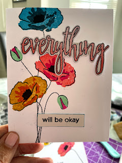
For the first card, I heat embossed a large flower outline in gold on ecru colored cardstock. Then I used my inks as watercolors! I have a glass craft mat so it was simply a matter of stamping color on it, spritzing with water and then paining in the petals. The embossed lines act as barriers to the ink. I used my distress inks in spiced marmalade, mustard seed, and pickled raspberry for the flower. To add the leaves, I made a mask for the flower so it looks like the leaves are behind it. I decided not to heat emboss the leaf outlines since the flower is the star of the show. Leaf color is cracked pistachio with a splash of mustard seed. Gotta love those color names!
When the painting was dry, I cut the paper to 5.25 x 4 inches. I stamped the sentiment (which came from the same Hero Arts/AlteNew collaboration as the flower) directly on the panel. Using the direct to paper inking technique taught in the class to edge my panel with pickled raspberry. Finally, I mounted the panel to my card base and added some sequins for bling.


Both your cards look beautiful. But I have something to share with you that might help you in the future if you want to improve your photos. Your first card looks a lot more gorgeous only because you took time to add a background behind it and kind of staged it, you know? So my eyes were drawn to it right away! Whereas in the second photo the backlight drew my attention and I noticed the beautiful flowers outside. Remember to position the card in a way that if there is a backlight then there should be a source of light on the front or at an angle too so that the card front has some light on it to become the focus of the photo. Also remember, I mentioned cropping the photo too close and your photos have no space on its sides. If you even need help or feedback on photos, please feel free to email me, I am here to help. This could really help in design team submissions or guest design spots, if you are interested :)
ReplyDeleteSo very pretty. The orange one is my favorite, I think it looks like a fiery sunset.
ReplyDelete