Posts

For the Guys

Image
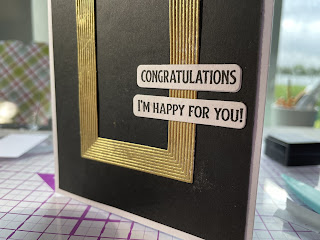
 Why is it always such a challenge to make masculine cards—-for any occasion? Here’s my submission “For the Guys,” done after watching the videos in the AlteNew Academy on this topic.  I have to agree with the instructor that geometric shapes, angles and edges feel more masculine than flowers and swirls, so I used the AlteNew Duodec cover die to create a black on white background.  Man there are a lot of little pieces to weed out of that die cut! Another challenge was gluing the intricate cutting it to my card base but fortunately I have a super fine tip on my Bearly Art Glue which dries clear.  I then stamped, colored and die cut three presents from AlteNew’s Celebrations set taking care to use strong primary colors (no pinks or corals for the guys!). The sentiment is from a stamp in my stash.  It has a clean, straightforward font and I matted it on a black background to make it pop. I adhered the sentiment and presents using foam tape for some added dimension ...

Ink Blending Techniques

Image
 I am so pleased with the look of the ink blended background on this Hanukkah card, made with Altenew’s Love and Light stamp and die set.  It really gives the impression of the candles glowing behind the die cut menorah (which I popped up for extra effect).   The candle glow background was stamped in Buttercup by Wendy Vecchi for Ranger Ink.  The menorah was stamped in Versafine Onyx Black and colored in with alcohol markers. The overall effect is a clean and simple holiday card.

Card 5 AECP Level 1

Image
 Here is my inlaid die cut card, a technique taught in the Level 1 Easy Die Cutting techniques class.  I was excited to learn this technique because although die cutting is one of the first things I learned about card making and scrapbooking, I had never known about it or tried to inlay die cut elements into a piece.   I used the Whimsical Flowers Stamp and die set, with a mix of stamp colors, including abandoned coral and picked raspberry distress inks from Ranger for the flowers new sprout and pear tart from Memento for leaves. The smaller flowers and flower centers are stamped in mustard seed and fossilized amber from Ranger.   Instead of just inlaying the flowers and leaves I stamped and cut, I used foam tape to make them pop.  I also added some iridescent pearls for some bling on the sentiment panel and in some flower centers. I took the sentiment from an unbranded set in my stash and matted it in red, a color not used in stamping but which coordinates...

AECP Clean and Simple

Image
 I’m really loving my courses in the AlteNew Educator Certification Progam (AECP), to the point that I can’t wait to try each new technique. In Class 4, the focus is on clean and simple styling, patterns, metallic accents and faux letter press.  I started with a pattern using a bouquet from the Celebrations Stamp set. I stamped the outline of the bouquet horizontally several times using black Versafine Ink, which, being waterproof, won’t react or run with watercolors.  I used a simple palette of pink and baby blue for the flowers with two tones of green for leaves.  The sentiment was stamped in black on a panel with edges also inked in black.  Center placement with foam tape for dimension looked best, I thought. Finally, three gold pearls add a bit of bling. For clean and simple styling, I used the middle and small sized butterflies from Painted Butterfly set.  I learned in the class to start at the midpoint and that’s where the first blue butterfly went. ...

Stencil Techniques

Image
 On to the third class of the AlteNew Education Certification Program: Stencil Techniques! In Lesson 1, we were challenged to make a stencil from a die cut in our stash.  I took my AlteNew mini delight feather stamp and die cut set and decided to give it a whirl!  I die cut feathers randomly in a standard A2 size panel (4.25” x 5.5”) and then used that as my stencil on another panel.  I used Poppy color Ranger Ink throughout for a monochrome look. Then I stamped the feather outline over the stenciled shapes, and I was really pleased with the whimsical look of having colored outside the lines!  I added the solid tip to each stenciled feather and also stamped some additional feather outlines around the edges of my panel.  Popped on the sentiment from the set and matted on matching designer paper before attaching it to the card base.  I love the look of this card Next, I stenciled a background using AlteNew’s Playful Patterns (stencils 2, 3 and 4, using t...

Compare and Contrast

Image
 So, of course I had to do a similar version of the Rose Blossom card using the die cuts to see how it compares to the previous version using masks.  I honestly can’t decide between the two!  With die cutting, there is a subtle white border around the leaves and flowers which does give the card some more dimension.  To me it’s a less painterly look though.   I added a different sentiment and more subtle background leaves from the same sets.  And sequins for bling.  The images were stamped and the die cuts were glued directly to the card base.  

Another Educator Certification Program Assignment

Image
For my “All About Layering 2” course….This card was challenging and fun to make with the Rose Blossom Stamp Set.  There are four layers for each rose, and 3 for each leaf, which means some serious attention must be paid to stamp placement of each layer.  I made a mask for each element in order to be able to have some appear in front of others.  I loved learning this technique in the coursework.  Although die cutting would be an easier way to do this, I like the portrait like look that is achieved with masking.   The sentiment is from the same stamp set, matted on emerald watercolor wishes from lawn fawn and popped up with foam tape for some dimension.  A few sequins for bling and a white on white mounting to the card base completes the look.